70s Color Palette: A Vibrant Throwback to Retro Design
The ’70s color palette is making a serious comeback, inspiring interior design, fashion, and even graphic design today. Known for its warm tones and eclectic vibe, this palette is a perfect blend of earthy hues and bold, vibrant colors. Let’s dive into what makes these colors so unique, why they’ve found their way back into modern-day trends, and how you can use them in your own style.
Origins and Influence of 70s color palette
During the 1970s, color trends were heavily influenced by the rise of the environmental movement, with a focus on natural, earthy colors. Popularized by interior designers and fashion trends, the palette was dominated by earthy browns, mustard yellows, and deep oranges, along with bold pops of vibrant colors like electric blue and avocado green.
Key Colors of the 70s
The palette is synonymous with earthy tones like brown, beige, and rust. But it’s not just about neutrals; bold, daring colors like orange, yellow, and red popped up in everything from clothing to kitchen appliances. These shades evoke warmth, nostalgia, and a sense of comfort.
The Popularity of Earthy Tones
In the ’70s, earthy tones weren’t just a trend—they were a lifestyle. These colors reflected a desire for comfort and simplicity, with hues drawn directly from nature.
Shades of Brown
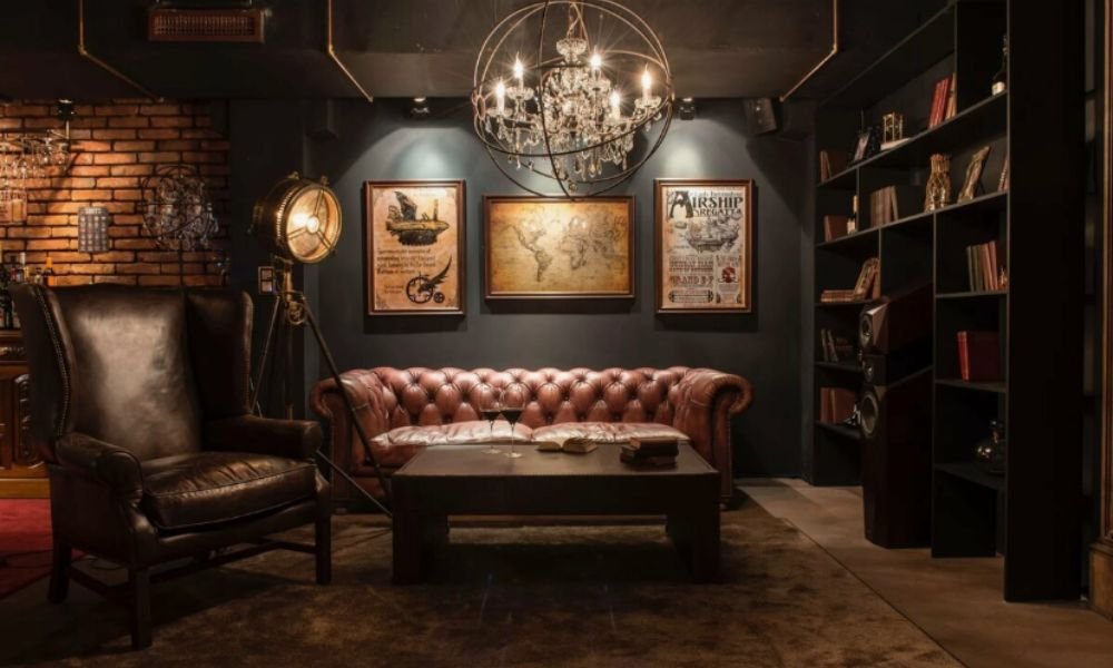
From caramel to chocolate, browns were a staple in the ’70s color palette. Whether in furniture, wall paint, or textiles, brown was a grounding force that added depth and warmth to any room.
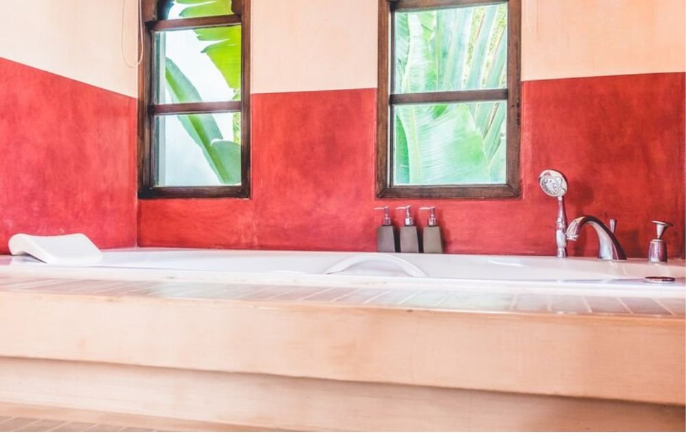
Terracotta and Mustard
These earthy hues became symbols of the ’70s. Terracotta’s reddish-brown warmth paired well with mustard yellow, creating a cozy yet vibrant atmosphere in homes.
Olive Green and Avocado
Two greens that were particularly popular were olive and avocado. These tones were often seen in kitchens, appliances, and fashion, giving a retro flair to the everyday items of the era.
Bold and Vibrant Colors
While earthy tones dominated the ’70s, bold and vibrant hues also had their moment in the spotlight.
Bright Orange
Orange wasn’t just a color; it was an attitude. Whether used in furniture, fashion, or decor, this electric hue brought energy and excitement into the ’70s home.
Bold Yellow
Alongside orange, yellow emerged as another bold statement color. From golden yellow to mustard, this sunny hue was seen in everything from kitchen tiles to bell-bottom pants.
Electric Blue
For those looking to add some cool contrast to the warm tones, electric blue emerged as the perfect pop of color. This vibrant blue could be found in everything from wall murals to accessories.
Patterns and Color Combinations
The ’70s weren’t just about solid colors. It was the era of experimentation with patterns and combinations.
Color Blocking
Color blocking was a big trend in both fashion and interior design. Bold, contrasting blocks of colors like mustard and teal, or orange and green, created striking visuals in home décor and clothing.
Geometric and Floral Patterns
Patterns like bold geometrics and oversized florals filled the interiors of ’70s homes. These patterns used the vibrant and earthy color palette to make each room feel unique and alive.
Incorporating the ’70s Color Palette in Home Décor
Today, the ’70s color palette can be incorporated into your home in a variety of ways, from small accents to large statements.
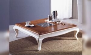
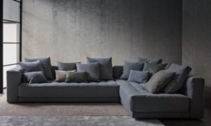
Living Room Ideas
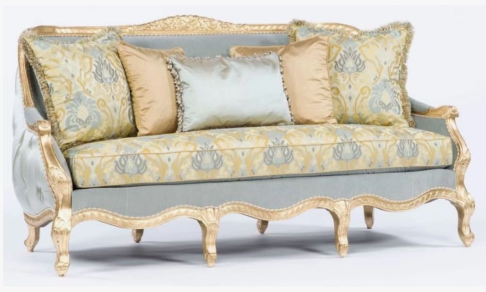
Think retro furniture in avocado green or mustard yellow, paired with soft brown leather sofas and geometric rugs. A ’70s-inspired living room is a great way to bring warmth and personality into your home.
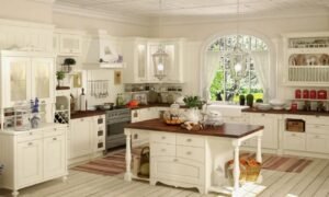
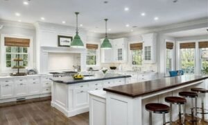
Kitchen Makeovers
Incorporate retro hues into your kitchen with vintage-inspired appliances or colorful ceramic tiles. Avocado-colored appliances are making a return, alongside mustard-hued cabinetry or accents.
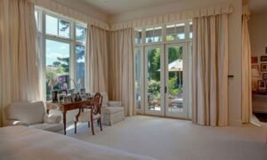
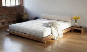
Bedroom Accents
A bedroom is the perfect place to experiment with these bold colors. Consider deep oranges, browns, and yellows for a cozy, restful space, or add pops of vibrant blue or green for an energized feel.
The Influence of the ’70s Color Palette in Fashion
The ’70s aesthetic is also making waves in modern fashion, with many designers tapping into the rich color palette of the era.
Retro-Inspired Outfits
Bold and groovy, ’70s fashion embraced bright colors like orange, red, and yellow in flared pants, jumpsuits, and dresses. Today’s fashion often pulls from these same shades, adding a modern twist.
Modern Take on Vintage Styles
A more subtle way to incorporate ’70s colors into fashion is through accessories. Think mustard yellow handbags, orange scarves, or green shoes to add a retro touch to a contemporary outfit.
Tips for Using the ’70s Color Palette Today
If you’re thinking about introducing the ’70s color palette into your home or wardrobe, here are a few tips to balance it with modern aesthetics.
Balance with Modern Neutrals
To avoid overwhelming your space or outfit with too much color, balance the bold tones with neutral shades like white, gray, or beige. This creates harmony and lets each color shine without clashing.
Experiment with Accent Pieces
Start small with the ’70s color palette by adding accent pieces like throw pillows, lamps, or rugs in retro hues. This allows you to embrace the style without fully committing to a complete overhaul.
Layering for Depth
Layering different textures and shades of the same color can create depth and interest. Mix a mustard yellow throw with a terracotta-colored rug and olive green cushions to bring the palette to life in your living room.
Earth Tones and Comfort
Earthy tones like browns, greens, and oranges are soothing and comforting, promoting relaxation and grounding energy in any space. These tones bring a sense of peace and harmony, ideal for creating a cozy home.
Bold Colors and Energy
Bright colors like electric blue and orange inject energy into a room or an outfit, creating a lively, upbeat atmosphere. These colors evoke feelings of excitement and creativity.
Conclusion
The ’70s color palette is more than just a retro trend—it’s a timeless expression of warmth, comfort, and boldness. Whether you’re renovating your home, updating your wardrobe, or just looking to add some nostalgic charm to your life, the ’70s colors are here to stay. So, embrace the vibe and experiment with these hues to bring some groovy style into your world.
FAQs about 70s color palette
What are the main colors of the ’70s color palette?
The main colors include earthy tones like brown, terracotta, and mustard, along with vibrant shades like orange, yellow, and electric blue.
Can I use the ’70s color palette in a modern home?
Absolutely! You can mix and match these colors with modern neutrals to create a stylish and updated look.
Are ’70s colors making a comeback in fashion?
Yes, the ’70s palette is influencing contemporary fashion, with bold hues appearing in both clothing and accessories.
How do I incorporate ’70s colors into my home décor?
Start with accent pieces like rugs, pillows, or lamps in retro colors. For a bigger impact, go for furniture or wall paint in vibrant shades.
What is the psychological impact of ’70s colors?
Earthy tones provide comfort and relaxation, while bold colors add energy and excitement to a space or outfit.
Share this content:


Post Comment